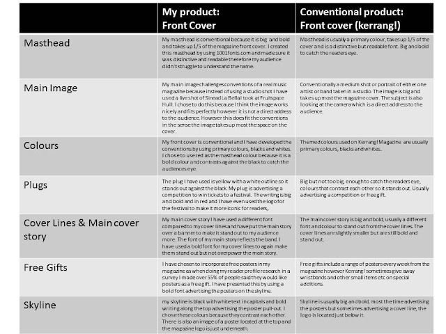
Looking back at my preliminary task i have come to terms with media and how media products are made. I have also learnt about how the different genres of music magazines are made and the conventions of a music magazine. For example my magazine uses darker colours such as reds, yellows and blacks as it is a rock/alternative magazine however a pop magazine would stereo-typically and conventionally use brighter colours such as pinks and blues. As you can see the photography on my music magazine is better than by preliminary task this is because i thought more about placement, mise-en-scene and costume design for my music magazine main image, the photo was taken at Fruitspace which is a live music venue and the image is taken of Sinead La Bella who is the vocalist of a real band, The Courtesans. The preliminary task main image was rushed and taken last minute of a friend in my livingroom, there was no thought about mise-en-scene and costumes, this is what makes my music magazine better as there is more thought put into it. I have also used more images on my music magazine and they're all more professional looking.
I have improved on using photoshop since my preliminary task, the main cover story on my music magazine is more visible and eye catching for my audience compared to my preliminary task this is because I learnt how to create a banner and use the stroke tool on the text to make it stand out more. However both of these magazines have the conventions of a magazine my music magazine is more improved and shows how far I've come since the preliminary task. The colours used on my preliminary task seem to wash out each other especially the gold/bronze colour against the white background, I took this into account when making my music magazine an therefore used colours that contrast each other such as white against white and white and yellow against black, this makes it easier for the audience to read. The photo used on my preliminary task is conventional as it is a medium shot and it is a direct address to the audience, however my music magazine main image is not conventional as it is not a direct address to the audience, I chose to do this because I believed it would be more attractive to my audience as when I got the results back from my survey 76% of my audience said they attend 1-4 live music events yearly therefore I believed this would be effective and would attract my audience as it is something they are interested in.
Thursday, 25 February 2016
1) In what ways does your media product use, develop or challenge forms and conventions of real media products?
My magazine compared to a real front cover
My magazine compared to a real contents page
My magazine compared to a real double page spread
I decided to change my double page spread to colour as there was no continuity with my products with the black and white page spread, I also changed the image to a more clear and bigger image.
Friday, 12 February 2016
Contents page house styles
Contents pages taken from different issues of Kerrang! magazine.
These contents pages all include a main dominant image of the cover star and the page number of where the article is located. They all contain a heading 'contents' and a heading 'Kerrang! this week' halfway down the page which are both in big bold letters in whiute and yellow to contrast against the black background/banner. They also include subheadings of the different sections of the magazine; feedback, news,features etc which are again in a bold font and in yellow to contrast against the black background/banner. A subscription offer is located in the right hand corner of the page which includes information about the subscription. An editors letter is located at the left hand side of every one of these contents pages in the form of a column and including a picture of the editor and a signature.Smaller images are shown on the page to make it more interesting and so the audience can visualize what is on each page.
Thursday, 11 February 2016
Subscribe to:
Comments (Atom)


