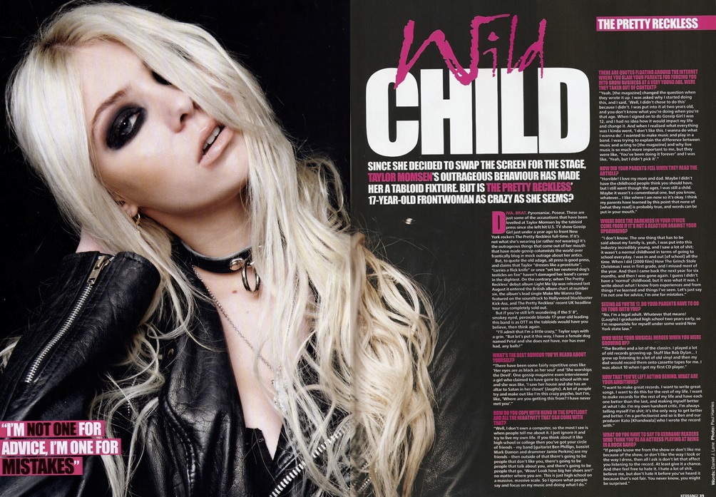
Kerrang! double page spread house styles;


Text fonts, styles and sizes are all used to create a house style. On all three of these double page spreads the title is big and bold and all the fonts and colours are interesting but readable, this is to draw the readers attention in and so the reader can actually read the title. The titles have used colours which stand out and colours which contrast against the background. All of these has a quotation from the artist which is also bold and in a bigger font but not as big as the title, however the first double page spread uses a quotation from the artist as a title which works just as well. All double page spreads use an appropriate main image which links to the text, all images show direct address to the reader as all the artists are looking directly into the camera. The colour scheme is the same throughout the double page spread.
No comments:
Post a Comment